


Amy's Office Transformation - Case Study
- Its Arranged

- May 31, 2023
- 5 min read
Updated: Jun 6, 2023
“Love and work are the two pillars of our life,” says Esther Perel, "Both give us a sense of identity, self-worth, belonging. But, adds Perel, there’s a key difference: “We all know that when our romantic relationships are in trouble, we need to invest in them; we need to put attention and effort, and sometimes seek help. Somehow, when it comes to work, we endure our relationships.”
-Esther Perel
This sentiment extends to our relationship with our work environment. Are you enduring yours?
Home Office Redesign and Design Refresh - A Case Study
How does your home office make you feel?
Amy is a partner at Its Arranged, a Full-service Professional Organizing and Move Management Company in Nashville. Her home office was converted from a guest room on the main floor.

Conflict
During her initial consultation, I asked her, “How does your home office make you feel?"
To which she responded, "I feel like I'm in a cave."
Amy's work-from-home space was trying to serve two purposes at the same time, with a queen guest bed to the right of the room and an L-shaped desk configured in the back left corner. She had cleverly mounted a mirror behind her to reflect adjacent art for zoom calls making good with just a dark corner of this room as her office.


She made do until she realized her need for a better experience in her workspace would inspire better work from herself and thus for her clients.
After a consultation, a design plan was created to identify how to dramatically change the experience of her office.
A mood board is an excellent vehicle to start piecing together the elements of a design and how they work together to achieve cohesiveness. Here, you develop your color story, explore textures, and discover the final elements to implement.


Actions
Choose Paint and Lighting
Paint is an excellent way to freshen a space. This room had a deep dark blue tone with a textured effect and silver trim. A fun design for a guest room to elicit some shut-eye, but not the most energy-inducing.

To bring a sense of calm and brightness, the room was painted BM Revere Pewter. The change from dark to light had a significant effect on the feel of the room.

With only 2 windows and very little natural light beaming in, 4 can lights were installed to brighten the room, as well as a new light fixture for a new style aesthetic.
Develop A Floor Plan
Every room should have a clear primary function from which its floor plan is derived. This space is an office more frequently than a guest room, and its layout needed to express that. The compromise of guest accommodations leaving this space was practical but still influenced its final iteration for a Murphy bed down the line.
Part of the process of arranging a space is considering how to distribute it best to meet the wants and needs of those who use it most generously.

Amy didn't want to have her back facing the door when sitting at her desk. The room was divided somewhat equally as a guest room and office space, but now her office would take center stage as the primary function of the room.
The approach to bringing the workspace central to the room was to create a feeling of being inside the nucleus of the brand she helps to run. The choice felt like a powerful metaphor to lead us through this design but it will later bring challenges. With the middle of the space spoken for, a clear pathway around the perimeter of the room would be needed.

Things we considered:
• Where will the printer live?
• Running power to the monitor
• Cord management
• Investing in a new rug only to cut it?
• A docking station


Define your space with an area rug:

To better define this room layout, we incorporated a large neutral area rug from Meyer's Flooring, cut to size.


All spaces have their unique challenges. Her two windows nearly butt to each corner, so finding curtain hardware that was beautiful and minimal to fit was also a unique challenge.
These sleek, simple brass rods and light-filtering flax linen curtains in Blush from West Elm were perfect for letting natural light in and adding style.
Decide What Stays and What Goes - Floor to Ceiling
For Amy, she wanted to keep her desk, a large abstract art piece, and everything else was up for discussion. We identified what could be taken out and then determined what would be brought in to meet the form and functional needs of the space.

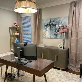
Amy is mostly all digital and very organized, so her storage needs are minimal. The right sideboard offered her the storage she needed and the two-desk surface she was accustomed to. This sideboard was the right depth and length to live against the wall of her two windows, as well as leaving some breathing room for curtain space.
Two tall skinny shelves helped conserve floor space while taking advantage of the height of the room, and provided surfaces for our form and function goals zoned for Amy. Shelves above would be pure form with decor and the two below for function. This meant two trays for the piles she makes throughout the day as a landing place to keep surfaces clear, and two baskets for her to store company materials. The above shelves for things that bring her delight. Books, flowers, and color.

Nested in between these two shelf towers is a bench for team meetings; easy to move as needed.
One thing to appreciate about this vignette is it is relatively inexpensive and leaves the option for a Murphy bed installation whenever Amy is ready.
Consider your main focal point and don't make your walls compete with each other
Amy enjoys a neutral space but loves color as well. The way we chose to balance this was by making the walls, the area rug, and the larger furnishings more neutral in tone. This allowed the large abstract piece to be the clear focal point of the room and created more intentional opportunities to add color.


To better celebrate it, the abstract piece was placed center of her backdrop between the two windows, and the large mirror was mounted on the wall across where she can admire it along with the scope of the room from her desk.
Consider selecting different types of art from your focal point in size and subject for variation. We did a nature canvas print and gold framed wallpaper samples gallery style with a large mirror on the remaining wall to bounce light and maximize the viewing of the design.
Adding a Sitting Space


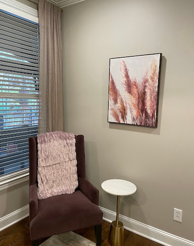

The overall goal of this project was to create a space that better served Amy, who is by nature a busy bee and an early riser. Creating a small space with a chair and table for screen breaks, brainstorming, or even morning meditations felt appropriate. A small moment for resurgence, mostly from pieces she already owned, with the exception of a small side table.
The Results
Now, when Amy is in her office, she enjoys it. The function of the room is well-established as an energy-giving workspace. It is lighter in its neutral base and brighter, celebrating colors that inspire her mood. The pathway is open and clear for her to come and go as she needs. The doom effect has bloomed in this space and Amy can better face the dynamic challenges of her work every day immersed in an office space that brings quality to how she works.
Are you ready for a redesign or design refresh but feeling stuck in the process or unsure where to start? Are you ready to transform a space or room in your home? We can help! Contact us today at hello@itsarranged.com to get started!


留言